6 Evaluating on-farm experiments
In this chapter, we focus on the participatory evaluation of on-farm experiments, involving farmers and other stakeholders (e.g., extension agents, NGOs, local authorities) directly in the interpretation of the results. Building on a dataset covering two seasons (2022/23 and 2023/24) of on-farm trials on pest damage, crop yield, and farmers’ perceptions, we show how results can be explored interactively during field days, feedback meetings, or local workshops using Shiny applications.
Shiny apps are interactive web applications built directly in R. They allow users to explore data dynamically — e.g., by selecting seasons or indicators — without requiring any programming knowledge. Because graphs and summaries update automatically when the user changes a selection, Shiny provides an intuitive interface for collective interpretation of results. These digital tools also enable farmers to see how their own fields contribute to wider patterns, creating a space where observations, interpretations, and preferences can be discussed openly. In this way, the Shiny app acts as a bridge between quantitative measurements and farmers’ qualitative, experiential knowledge, helping transform experimental results into practical insights for decision-making.
Download the dataset used throughout this chapter here: https://github.com/FBaudron/Supporting-codesign/blob/main/06-evaluating-experiments/DATA%20FOR%20SHINY.xlsx.
The data were collected on sorghum over two seasons and include pest incidence and severity, crop yield, and farmers’ overall evaluation of the three experimental treatments: conventional practice (CONV), conservation agriculture (CA), and push–pull (PPULL). The next code chunk loads the raw dataset, prepares factor variables, and separates the two seasons for later comparisons.
A standalone R script containing the full workflow below is available at the following link: https://github.com/FBaudron/Supporting-codesign/blob/main/06-evaluating-experiments/visualization_of_treatments_performance.R.
6.1 Visualization of treatments’ performance
Before introducing the interactive application, we build the graphs that will later be embedded in the Shiny interface, using data from the 2022/23 season (the app will allow the user to switch between this season and 2023/24).
We begin by clearing the workspace, loading the required packages, importing the dataset, and splitting it into separate objects for the two seasons.
rm(list = ls())

if (!require("openxlsx")) install.packages("openxlsx")
if (!require("ggplot2")) install.packages("ggplot2")
if (!require("ggdist")) install.packages("ggdist")
if (!require("ggthemes")) install.packages("ggthemes")
if (!require("egg")) install.packages("egg")
if (!require("ggradar")) install.packages("ggradar")

library(openxlsx)
library(ggplot2)
library(ggdist)
library(ggthemes)
library(egg)
library(ggradar)

data = read.xlsx("DATA FOR SHINY.xlsx", sheet = 1)

data$Treatment = factor(data$Treatment, levels = c("CONV", "CA", "PPULL"))

data_2022_23 = subset(data, Season == "2022/23")
data_2023_24 = subset(data, Season == "2023/24")
6.1.1 Pest pressure in different treatments
We first explore pest pressure by visualising incidence and severity for three major pests: armoured cricket, fall armyworm, and stemborer. We combine half-eye distributions, boxplots, and jittered points to convey both the central tendencies and underlying variability across farmers’ fields. We use the the R packages ggplot2 (Wickham 2016) and ggdist (Kay 2025).
cri = data_2022_23[, c(1:3, 4:5)]
names(cri)[4] = "Incidence"
names(cri)[5] = "Severity"

faw = data_2022_23[, c(1:3, 6:7)]
names(faw)[4] = "Incidence"
names(faw)[5] = "Severity"

stm = data_2022_23[, c(1:3, 8:9)]
names(stm)[4] = "Incidence"
names(stm)[5] = "Severity"


p1 = ggplot(cri, aes(x = Treatment, y = Incidence, fill = Treatment)) + ggdist::stat_halfeye(adjust = 0.6,
    width = 0.4, .width = 0, justification = -0.4, point_colour = NA, alpha = 0.5,
    color = "black") + geom_boxplot(width = 0.2, outlier.shape = NA, alpha = 0.5) +
    geom_point(shape = 21, size = 2, alpha = 0.5, position = position_jitter(seed = 1,
        width = 0.1)) + scale_fill_manual(values = c("#FCA50AFF", "#DD513AFF", "#932667FF")) +
    ylab("") + xlab("") + theme_few() + ggtitle("Armored cricket - Incidence (%)") +
    theme(legend.position = "none", plot.title = element_text(size = 16, face = "bold",
        margin = ggplot2::margin(0, 0, 10, 0)), axis.text = element_text(size = 10),
        axis.title = element_blank(), legend.title = element_blank()) + coord_flip()

p2 = ggplot(faw, aes(x = Treatment, y = Incidence, fill = Treatment)) + ggdist::stat_halfeye(adjust = 0.6,
    width = 0.4, .width = 0, justification = -0.4, point_colour = NA, alpha = 0.5,
    color = "black") + geom_boxplot(width = 0.2, outlier.shape = NA, alpha = 0.5) +
    geom_point(shape = 21, size = 2, alpha = 0.5, position = position_jitter(seed = 1,
        width = 0.1)) + scale_fill_manual(values = c("#FCA50AFF", "#DD513AFF", "#932667FF")) +
    ylab("") + xlab("") + theme_few() + ggtitle("Fall armyworm - Incidence (%)") +
    theme(legend.position = "none", plot.title = element_text(size = 16, face = "bold",
        margin = ggplot2::margin(0, 0, 10, 0)), axis.text = element_text(size = 10),
        axis.title = element_blank(), legend.title = element_blank()) + coord_flip()

p3 = ggplot(stm, aes(x = Treatment, y = Incidence, fill = Treatment)) + ggdist::stat_halfeye(adjust = 0.6,
    width = 0.4, .width = 0, justification = -0.4, point_colour = NA, alpha = 0.5,
    color = "black") + geom_boxplot(width = 0.2, outlier.shape = NA, alpha = 0.5) +
    geom_point(shape = 21, size = 2, alpha = 0.5, position = position_jitter(seed = 1,
        width = 0.1)) + scale_fill_manual(values = c("#FCA50AFF", "#DD513AFF", "#932667FF")) +
    ylab("") + xlab("") + theme_few() + ggtitle("Stemborer - Incidence (%)") + theme(legend.position = "none",
    plot.title = element_text(size = 16, face = "bold", margin = ggplot2::margin(0,
        0, 10, 0)), axis.text = element_text(size = 10), axis.title = element_blank(),
    legend.title = element_blank()) + coord_flip()

p4 = ggplot(cri, aes(x = Treatment, y = Severity, fill = Treatment)) + ggdist::stat_halfeye(adjust = 0.6,
    width = 0.4, .width = 0, justification = -0.4, point_colour = NA, alpha = 0.5,
    color = "black") + geom_boxplot(width = 0.2, outlier.shape = NA, alpha = 0.5) +
    geom_point(shape = 21, size = 2, alpha = 0.5, position = position_jitter(seed = 1,
        width = 0.1)) + scale_fill_manual(values = c("#FCA50AFF", "#DD513AFF", "#932667FF")) +
    ylab("") + xlab("") + theme_few() + ggtitle("Armored cricket - Severity (1-9)") +
    theme(legend.position = "none", plot.title = element_text(size = 16, face = "bold",
        margin = ggplot2::margin(0, 0, 10, 0)), axis.text = element_text(size = 10),
        axis.title = element_blank(), legend.title = element_blank()) + coord_flip()

p5 = ggplot(faw, aes(x = Treatment, y = Severity, fill = Treatment)) + ggdist::stat_halfeye(adjust = 0.6,
    width = 0.4, .width = 0, justification = -0.4, point_colour = NA, alpha = 0.5,
    color = "black") + geom_boxplot(width = 0.2, outlier.shape = NA, alpha = 0.5) +
    geom_point(shape = 21, size = 2, alpha = 0.5, position = position_jitter(seed = 1,
        width = 0.1)) + scale_fill_manual(values = c("#FCA50AFF", "#DD513AFF", "#932667FF")) +
    ylab("") + xlab("") + theme_few() + ggtitle("Fall armyworm - Severity (1-9)") +
    theme(legend.position = "none", plot.title = element_text(size = 16, face = "bold",
        margin = ggplot2::margin(0, 0, 10, 0)), axis.text = element_text(size = 10),
        axis.title = element_blank(), legend.title = element_blank()) + coord_flip()

p6 = ggplot(stm, aes(x = Treatment, y = Severity, fill = Treatment)) + ggdist::stat_halfeye(adjust = 0.6,
    width = 0.4, .width = 0, justification = -0.4, point_colour = NA, alpha = 0.5,
    color = "black") + geom_boxplot(width = 0.2, outlier.shape = NA, alpha = 0.5) +
    geom_point(shape = 21, size = 2, alpha = 0.5, position = position_jitter(seed = 1,
        width = 0.1)) + scale_fill_manual(values = c("#FCA50AFF", "#DD513AFF", "#932667FF")) +
    ylab("") + xlab("") + theme_few() + ggtitle("Stemborer - Severity (1-9)") + theme(legend.position = "none",
    plot.title = element_text(size = 16, face = "bold", margin = ggplot2::margin(0,
        0, 10, 0)), axis.text = element_text(size = 10), axis.title = element_blank(),
    legend.title = element_blank()) + coord_flip()

ggarrange(p1, p4, p2, p5, p3, p6, ncol = 2, nrow = 3, widths = c(1, 1), heights = c(1,
    1, 1))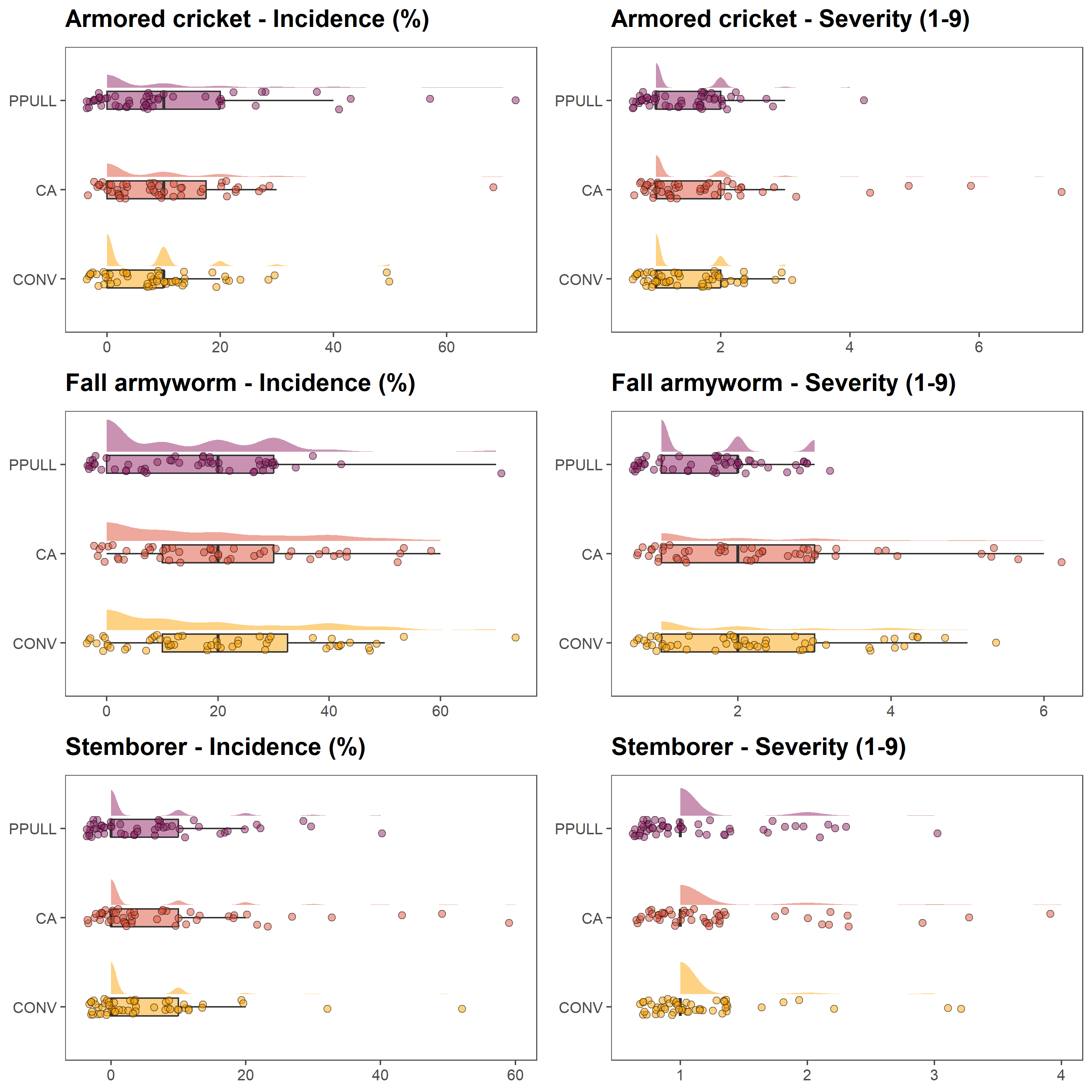
6.1.2 Productivity of different treatments
In the next set of graphs, we show grain and biomass yields for each treatment. As for the previous panel of graphs, We use half-eye distributions, boxplots and jittered points.
yldcrl = data_2022_23[, c(1:3, 10:11)]
yldcrl = unique(yldcrl)

p7 = ggplot(yldcrl, aes(x = Treatment, y = YLD, fill = Treatment)) + ggdist::stat_halfeye(adjust = 0.6,
    width = 0.4, .width = 0, justification = -0.4, point_colour = NA, alpha = 0.5,
    color = "black") + geom_boxplot(width = 0.2, outlier.shape = NA, alpha = 0.5) +
    geom_point(shape = 21, size = 2, alpha = 0.5, position = position_jitter(seed = 1,
        width = 0.1)) + scale_fill_manual(values = c("#FCA50AFF", "#DD513AFF", "#932667FF")) +
    ylab("") + xlab("") + theme_few() + ggtitle("Cereal yield - Grain (t/ha)") +
    theme(legend.position = "none", plot.title = element_text(size = 16, face = "bold",
        margin = ggplot2::margin(0, 0, 10, 0)), axis.text = element_text(size = 10),
        axis.title = element_blank(), legend.title = element_blank()) + coord_flip()

p8 = ggplot(yldcrl, aes(x = Treatment, y = BIO, fill = Treatment)) + ggdist::stat_halfeye(adjust = 0.6,
    width = 0.4, .width = 0, justification = -0.4, point_colour = NA, alpha = 0.5,
    color = "black") + geom_boxplot(width = 0.2, outlier.shape = NA, alpha = 0.5) +
    geom_point(shape = 21, size = 2, alpha = 0.5, position = position_jitter(seed = 1,
        width = 0.1)) + scale_fill_manual(values = c("#FCA50AFF", "#DD513AFF", "#932667FF")) +
    ylab("") + xlab("") + theme_few() + ggtitle("Cereal yield - Biomass (t/ha)") +
    theme(legend.position = "none", plot.title = element_text(size = 16, face = "bold",
        margin = ggplot2::margin(0, 0, 10, 0)), axis.text = element_text(size = 10),
        axis.title = element_blank(), legend.title = element_blank()) + coord_flip()

ggarrange(p7, p8, ncol = 2, nrow = 1, widths = c(1, 1), heights = c(1))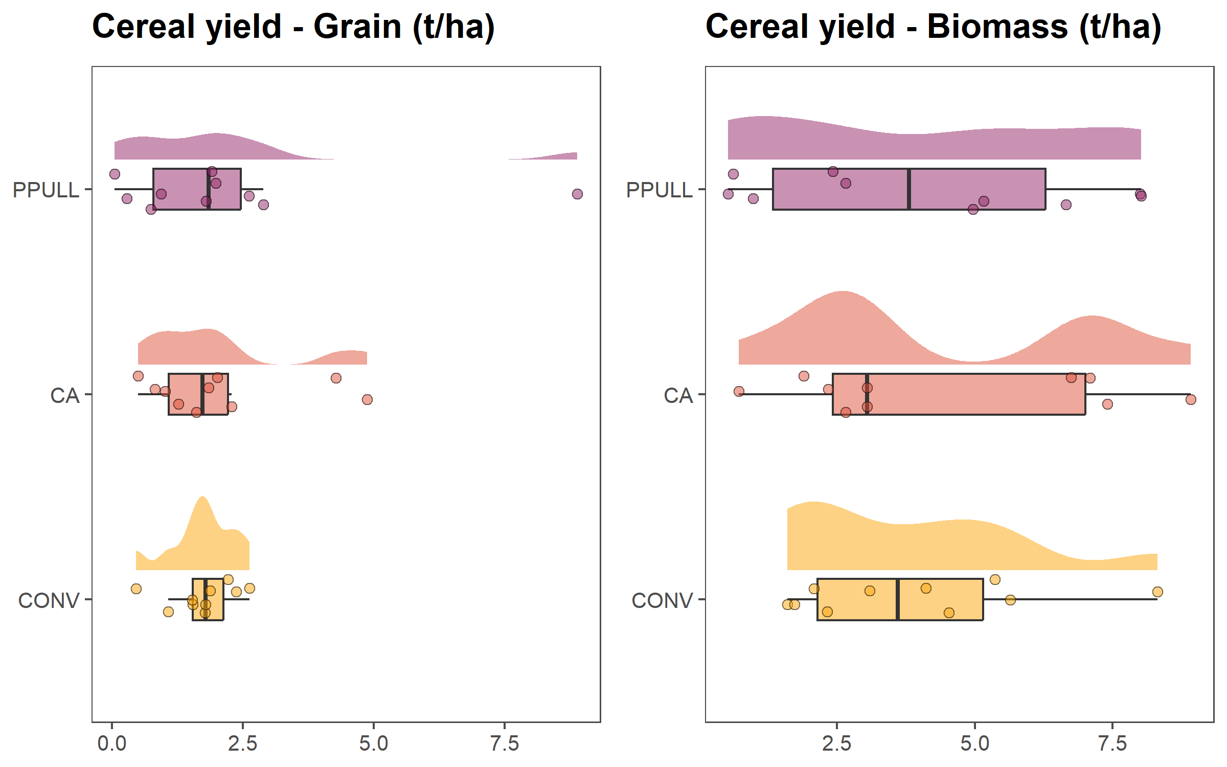
6.1.3 Rating of treatments by different demographic groups
In the last set of plot, we compare how different demographic groups — older females, older males, young females, and young males — evaluated the three treatments using radar plots built with the R package ggradar (Bion 2023).
The plots below display the composite scores for each group, allowing a visualization of convergences and divergences in perceptions.
of = data_2022_23[, c(1:2, 12:18)]
of$Group = rep("Older females", nrow(of))
of = unique(of)

om = data_2022_23[, c(1:2, 19:25)]
om$Group = rep("Older males", nrow(om))
om = unique(om)

yf = data_2022_23[, c(1:2, 26:32)]
yf$Group = rep("Young females", nrow(yf))
yf = unique(yf)

ym = data_2022_23[, c(1:2, 33:39)]
ym$Group = rep("Young males", nrow(ym))
ym = unique(ym)

names(of)[c(3:9)] = c("Grain", "Biomass", "Inputs", "Labour", "Pests", "Drought",
    "Soil")

names(om)[c(3:9)] = c("Grain", "Biomass", "Inputs", "Labour", "Pests", "Drought",
    "Soil")

names(yf)[c(3:9)] = c("Grain", "Biomass", "Inputs", "Labour", "Pests", "Drought",
    "Soil")

names(ym)[c(3:9)] = c("Grain", "Biomass", "Inputs", "Labour", "Pests", "Drought",
    "Soil")

rat = rbind(of, om, yf, ym)

conv = subset(rat, Treatment == "CONV")
ca = subset(rat, Treatment == "CA")
ppull = subset(rat, Treatment == "PPULL")

p9 = ggradar(conv[, c(10, 3:9)], plot.title = "Conventional Practice", values.radar = c("0",
    "5", "10"), grid.min = 0, grid.mid = 5, grid.max = 10, group.line.width = 1,
    group.point.size = 3, group.colours = c("#FCA50AFF", "#DD513AFF", "#932667FF",
        "#420A68FF"), fill = TRUE, fill.alpha = 0.2, background.circle.colour = "white",
    gridline.mid.colour = "grey", legend.position = "none") + theme(plot.title = element_text(size = 18,
    face = "bold", hjust = 0.5))

p10 = ggradar(ca[, c(10, 3:9)], plot.title = "Conservation Agriculture", values.radar = c("0",
    "5", "10"), grid.min = 0, grid.mid = 5, grid.max = 10, group.line.width = 1,
    group.point.size = 3, group.colours = c("#FCA50AFF", "#DD513AFF", "#932667FF",
        "#420A68FF"), fill = TRUE, fill.alpha = 0.2, background.circle.colour = "white",
    gridline.mid.colour = "grey", legend.position = "bottom") + theme(plot.title = element_text(size = 18,
    face = "bold", hjust = 0.5))


p11 = ggradar(ppull[, c(10, 3:9)], plot.title = "Push-Pull", values.radar = c("0",
    "5", "10"), grid.min = 0, grid.mid = 5, grid.max = 10, group.line.width = 1,
    group.point.size = 3, group.colours = c("#FCA50AFF", "#DD513AFF", "#932667FF",
        "#420A68FF"), fill = TRUE, fill.alpha = 0.2, background.circle.colour = "white",
    gridline.mid.colour = "grey", legend.position = "none") + theme(plot.title = element_text(size = 18,
    face = "bold", hjust = 0.5))


ggarrange(p9, p10, p11, ncol = 3, nrow = 1, widths = c(1, 1, 1), heights = c(1))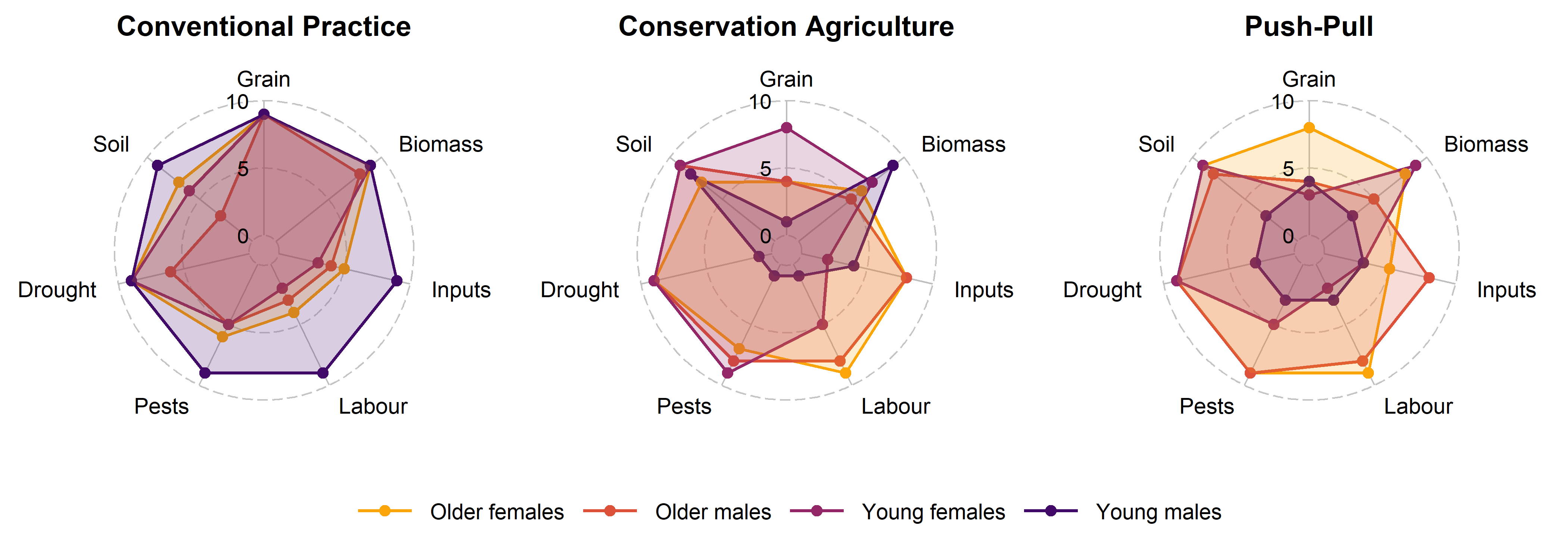
6.2 Shiny app
6.2.1 Decription of a Shiny app
A Shiny application is built around two core components: the user interface and the server logic. The user interface (ui) defines what participants see on the screen: dropdown menus (e.g., to choose a season), tabs to navigate between indicators, and the spaces where plots or tables will appear. It provides the visual structure of the app and determines how users interact with the data.
The server component is where the analytical work takes place. It receives the user’s selections, filters or processes the data accordingly, performs calculations or summarisation, and generates the updated plots and tables that appear on the screen.
Several R packages support this process. The core package is shiny (Chang et al. 2024), which provides the framework for building reactive web applications. Two additional packages improve the user experience of the app. bslib (Sievert, Cheng, and Aden-Buie 2025) allows customisation of the app’s appearance using Bootstrap themes, making the layout cleaner and compatible across devices. shinycssloaders (Attali and Sali 2024) adds animated loading indicators (‘spinners’) to plots so that users immediately see when a graph is being recalculated, which is helpful when working with larger datasets.
What makes Shiny powerful is its use of reactive programming. Whenever a user changes a selection—choosing a different indicator or switching seasons—the app automatically re-runs only the parts of the code affected by that change and updates the outputs instantly. This creates the experience of a live, responsive system, even though all processing occurs within R. Thanks to this structure, Shiny apps can serve as accessible interfaces to complex datasets, allowing farmers and other stakeholders to explore results interactively and contribute to the interpretation.
6.2.2 Example of a Shiny app
The Shiny script below reproduces the interactive application used in this chapter. It allows users to visualize the graphs developed above for a selected season and to explore three domains: pest damage, crop yield, and farmers’ perceptions.
A standalone R script for the app is available at the following link: https://github.com/FBaudron/Supporting-codesign/blob/main/06-evaluating-experiments/app.R.
library(openxlsx)
library(ggplot2)
library(ggdist)
library(ggthemes)
library(egg)
library(ggradar)
library(shiny)
library(bslib)
library(shinycssloaders)

data = read.xlsx("DATA FOR SHINY.xlsx", sheet = 1)

data$Treatment = factor(data$Treatment, levels = c("CONV", "CA", "PPULL"))

data_2022_23 = subset(data, Season == "2022/23")
data_2023_24 = subset(data, Season == "2023/24")


# user interface

ui = fluidPage(
  theme = bs_theme(version = 5, bootswatch = "flatly"),

  titlePanel(
    h2("AEI-Zimbabwe On-Farm Experiments Evaluation App (Mbire)",
       style = "font-size: 24px; font-weight: bold;")
  ),

  sidebarLayout(
    sidebarPanel(
      selectInput(inputId = "dataset",
                  label = "Choose season:",
                  choices = c("2022/23", "2023/24"))
    ),

    mainPanel(
      tabsetPanel(type = "tabs",
                  tabPanel("Pest damage", withSpinner(plotOutput("plot1"))),
                  tabPanel("Crop yield", withSpinner(plotOutput("plot2"))),
                  tabPanel("Farmer perception", withSpinner(plotOutput("plot3")))
      )
    )
  )
)


# Server logic

server = function(input, output) {

  datasetInput = reactive({
    switch(input$dataset,
           "2022/23" = data_2022_23,
           "2023/24" = data_2023_24)
  })

  output$plot1 = renderPlot({
    data = datasetInput()

    cri = data[, c(1:3, 4:5)]
    names(cri)[4] = "Incidence"
    names(cri)[5] = "Severity"

    faw = data[, c(1:3, 6:7)]
    names(faw)[4] = "Incidence"
    names(faw)[5] = "Severity"

    stm = data[, c(1:3, 8:9)]
    names(stm)[4] = "Incidence"
    names(stm)[5] = "Severity"

    p1 = ggplot(cri, aes(x = Treatment, y = Incidence, fill = Treatment)) +
      ggdist::stat_halfeye(adjust = 0.6, width = 0.4, .width = 0, justification = -.4, point_colour = NA, alpha = 0.5, color = "black") +
      geom_boxplot(width = .2, outlier.shape = NA, alpha = 0.5) +
      geom_point(shape = 21, size = 2, alpha = 0.5, position = position_jitter(seed = 1, width = .1)) +
      scale_fill_manual(values = c("#FCA50AFF", "#DD513AFF", "#932667FF")) +
      ylab("") + xlab("") +
      theme_few() +
      ggtitle("Armored cricket - Incidence (%)") +
      theme(legend.position = "none",
            plot.title = element_text(size = 16, face = "bold", margin = ggplot2::margin(0, 0, 10, 0)),
            axis.text = element_text(size = 10),
            axis.title = element_blank(),
            legend.title = element_blank()) +
      coord_flip()

    p2 = ggplot(faw, aes(x = Treatment, y = Incidence, fill = Treatment)) +
      ggdist::stat_halfeye(adjust = 0.6, width = 0.4, .width = 0, justification = -.4, point_colour = NA, alpha = 0.5, color = "black") +
      geom_boxplot(width = .2, outlier.shape = NA, alpha = 0.5) +
      geom_point(shape = 21, size = 2, alpha = 0.5, position = position_jitter(seed = 1, width = .1)) +
      scale_fill_manual(values = c("#FCA50AFF", "#DD513AFF", "#932667FF")) +
      ylab("") + xlab("") +
      theme_few() +
      ggtitle("Fall armyworm - Incidence (%)") +
      theme(legend.position = "none",
            plot.title = element_text(size = 16, face = "bold", margin = ggplot2::margin(0, 0, 10, 0)),
            axis.text = element_text(size = 10),
            axis.title = element_blank(),
            legend.title = element_blank()) +
      coord_flip()

    p3 = ggplot(stm, aes(x = Treatment, y = Incidence, fill = Treatment)) +
      ggdist::stat_halfeye(adjust = 0.6, width = 0.4, .width = 0, justification = -.4, point_colour = NA, alpha = 0.5, color = "black") +
      geom_boxplot(width = .2, outlier.shape = NA, alpha = 0.5) +
      geom_point(shape = 21, size = 2, alpha = 0.5, position = position_jitter(seed = 1, width = .1)) +
      scale_fill_manual(values = c("#FCA50AFF", "#DD513AFF", "#932667FF")) +
      ylab("") + xlab("") +
      theme_few() +
      ggtitle("Stemborer - Incidence (%)") +
      theme(legend.position = "none",
            plot.title = element_text(size = 16, face = "bold", margin = ggplot2::margin(0, 0, 10, 0)),
            axis.text = element_text(size = 10),
            axis.title = element_blank(),
            legend.title = element_blank()) +
      coord_flip()

    p4 = ggplot(cri, aes(x = Treatment, y = Severity, fill = Treatment)) +
      ggdist::stat_halfeye(adjust = 0.6, width = 0.4, .width = 0, justification = -.4, point_colour = NA, alpha = 0.5, color = "black") +
      geom_boxplot(width = .2, outlier.shape = NA, alpha = 0.5) +
      geom_point(shape = 21, size = 2, alpha = 0.5, position = position_jitter(seed = 1, width = .1)) +
      scale_fill_manual(values = c("#FCA50AFF", "#DD513AFF", "#932667FF")) +
      ylab("") + xlab("") +
      theme_few() +
      ggtitle("Armored cricket - Severity (1-9)") +
      theme(legend.position = "none",
            plot.title = element_text(size = 16, face = "bold", margin = ggplot2::margin(0, 0, 10, 0)),
            axis.text = element_text(size = 10),
            axis.title = element_blank(),
            legend.title = element_blank()) +
      coord_flip()

    p5 = ggplot(faw, aes(x = Treatment, y = Severity, fill = Treatment)) +
      ggdist::stat_halfeye(adjust = 0.6, width = 0.4, .width = 0, justification = -.4, point_colour = NA, alpha = 0.5, color = "black") +
      geom_boxplot(width = .2, outlier.shape = NA, alpha = 0.5) +
      geom_point(shape = 21, size = 2, alpha = 0.5, position = position_jitter(seed = 1, width = .1)) +
      scale_fill_manual(values = c("#FCA50AFF", "#DD513AFF", "#932667FF")) +
      ylab("") + xlab("") +
      theme_few() +
      ggtitle("Fall armyworm - Severity (1-9)") +
      theme(legend.position = "none",
            plot.title = element_text(size = 16, face = "bold", margin = ggplot2::margin(0, 0, 10, 0)),
            axis.text = element_text(size = 10),
            axis.title = element_blank(),
            legend.title = element_blank()) +
      coord_flip()

    p6 = ggplot(stm, aes(x = Treatment, y = Severity, fill = Treatment)) +
      ggdist::stat_halfeye(adjust = 0.6, width = 0.4, .width = 0, justification = -.4, point_colour = NA, alpha = 0.5, color = "black") +
      geom_boxplot(width = .2, outlier.shape = NA, alpha = 0.5) +
      geom_point(shape = 21, size = 2, alpha = 0.5, position = position_jitter(seed = 1, width = .1)) +
      scale_fill_manual(values = c("#FCA50AFF", "#DD513AFF", "#932667FF")) +
      ylab("") + xlab("") +
      theme_few() +
      ggtitle("Stemborer - Severity (1-9)") +
      theme(legend.position = "none",
            plot.title = element_text(size = 16, face = "bold", margin = ggplot2::margin(0, 0, 10, 0)),
            axis.text = element_text(size = 10),
            axis.title = element_blank(),
            legend.title = element_blank()) +
      coord_flip()

    ggarrange(p1, p4, p2, p5, p3, p6,
                     ncol = 2, nrow = 3, widths = c(1, 1), heights = c(1, 1, 1))

  }, height = 480)


  output$plot2 = renderPlot({
    data = datasetInput()

    yldcrl = data[, c(1:3, 10:11)]
    yldcrl = unique(yldcrl)

    p7 = ggplot(yldcrl, aes(x = Treatment, y = YLD, fill = Treatment)) +
      ggdist::stat_halfeye(adjust = 0.6, width = 0.4, .width = 0, justification = -.4, point_colour = NA, alpha = 0.5, color = "black") +
      geom_boxplot(width = .2, outlier.shape = NA, alpha = 0.5) +
      geom_point(shape = 21, size = 2, alpha = 0.5, position = position_jitter(seed = 1, width = .1)) +
      scale_fill_manual(values = c("#FCA50AFF", "#DD513AFF", "#932667FF")) +
      ylab("") + xlab("") +
      theme_few() +
      ggtitle("Cereal yield - Grain (t/ha)") +
      theme(legend.position = "none",
            plot.title = element_text(size = 16, face = "bold", margin = ggplot2::margin(0, 0, 10, 0)),
            axis.text = element_text(size = 10),
            axis.title = element_blank(),
            legend.title = element_blank()) +
      coord_flip()

    p8 = ggplot(yldcrl, aes(x = Treatment, y = BIO, fill = Treatment)) +
      ggdist::stat_halfeye(adjust = 0.6, width = 0.4, .width = 0, justification = -.4, point_colour = NA, alpha = 0.5, color = "black") +
      geom_boxplot(width = .2, outlier.shape = NA, alpha = 0.5) +
      geom_point(shape = 21, size = 2, alpha = 0.5, position = position_jitter(seed = 1, width = .1)) +
      scale_fill_manual(values = c("#FCA50AFF", "#DD513AFF", "#932667FF")) +
      ylab("") + xlab("") +
      theme_few() +
      ggtitle("Cereal yield - Biomass (t/ha)") +
      theme(legend.position = "none",
            plot.title = element_text(size = 16, face = "bold", margin = ggplot2::margin(0, 0, 10, 0)),
            axis.text = element_text(size = 10),
            axis.title = element_blank(),
            legend.title = element_blank()) +
      coord_flip()

    ggarrange(p7, p8,
                     ncol = 2, nrow = 1, widths = c(1, 1), heights = c(1))

  }, height = 480)


  output$plot3 = renderPlot({
    data = datasetInput()

    of = data[, c(1:2, 12:18)]
    of$Group = rep("Older females", nrow(of))
    of = unique(of)

    om = data[, c(1:2, 19:25)]
    om$Group = rep("Older males", nrow(om))
    om = unique(om)

    yf = data[, c(1:2, 26:32)]
    yf$Group = rep("Young females", nrow(yf))
    yf = unique(yf)

    ym = data[, c(1:2, 33:39)]
    ym$Group = rep("Young males", nrow(ym))
    ym = unique(ym)

    names(of)[c(3:9)] = c("Grain", "Biomass", "Inputs", "Labour", "Pests", "Drought",
                          "Soil")

    names(om)[c(3:9)] = c("Grain", "Biomass", "Inputs", "Labour", "Pests", "Drought",
                          "Soil")

    names(yf)[c(3:9)] = c("Grain", "Biomass", "Inputs", "Labour", "Pests", "Drought",
                          "Soil")

    names(ym)[c(3:9)] = c("Grain", "Biomass", "Inputs", "Labour", "Pests", "Drought",
                          "Soil")

    rat = rbind(of, om, yf, ym)

    conv = subset(rat, Treatment == "CONV")
    ca = subset(rat, Treatment == "CA")
    ppull = subset(rat, Treatment == "PPULL")

    p9 = ggradar(
      conv[, c(10, 3:9)],
      plot.title = "Conventional Practice",
      values.radar = c("0", "5", "10"),
      grid.min = 0, grid.mid = 5, grid.max = 10,
      group.line.width = 1,
      group.point.size = 3,
      group.colours = c("#FCA50AFF", "#DD513AFF", "#932667FF", "#420A68FF"),
      fill = TRUE, fill.alpha = 0.2,
      background.circle.colour = "white",
      gridline.mid.colour = "grey",
      legend.position = "none") +
      theme(plot.title = element_text(size = 18, face = "bold", hjust = 0.5))

    p10 = ggradar(
      ca[, c(10, 3:9)],
      plot.title = "Conservation Agriculture",
      values.radar = c("0", "5", "10"),
      grid.min = 0, grid.mid = 5, grid.max = 10,
      group.line.width = 1,
      group.point.size = 3,
      group.colours = c("#FCA50AFF", "#DD513AFF", "#932667FF", "#420A68FF"),
      fill = TRUE, fill.alpha = 0.2,
      background.circle.colour = "white",
      gridline.mid.colour = "grey",
      legend.position = "bottom") +
      theme(plot.title = element_text(size = 18, face = "bold", hjust = 0.5))

    p11 = ggradar(
      ppull[, c(10, 3:9)],
      plot.title = "Push-Pull",
      values.radar = c("0", "5", "10"),
      grid.min = 0, grid.mid = 5, grid.max = 10,
      group.line.width = 1,
      group.point.size = 3,
      group.colours = c("#FCA50AFF", "#DD513AFF", "#932667FF", "#420A68FF"),
      fill = TRUE, fill.alpha = 0.2,
      background.circle.colour = "white",
      gridline.mid.colour = "grey",
      legend.position = "none") +
      theme(plot.title = element_text(size = 18, face = "bold", hjust = 0.5))

    ggarrange(p9, p10, p11,
                     ncol = 3, nrow = 1, widths = c(1, 1, 1), heights=c(1))

  }, height = 480)

}


# Run the app

shinyApp(ui, server)
The deployed app is accessible here: https://fredericbaudron.shinyapps.io/on_farm_experiments_evaluation_app/.